The Annotation Analytics Tab
To access the annotation analytics tab, go to the Annotations section of your project, then click on the Analytics tab.
This section offers a summarized visual report of all the annotations present in your project.
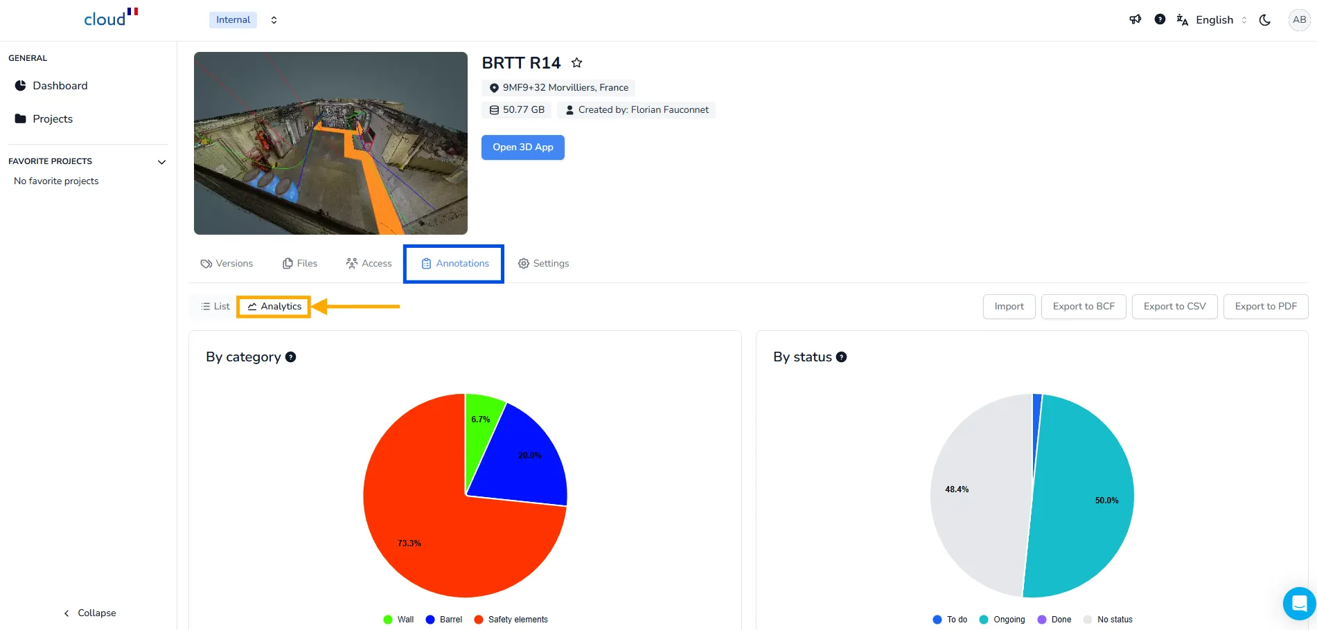
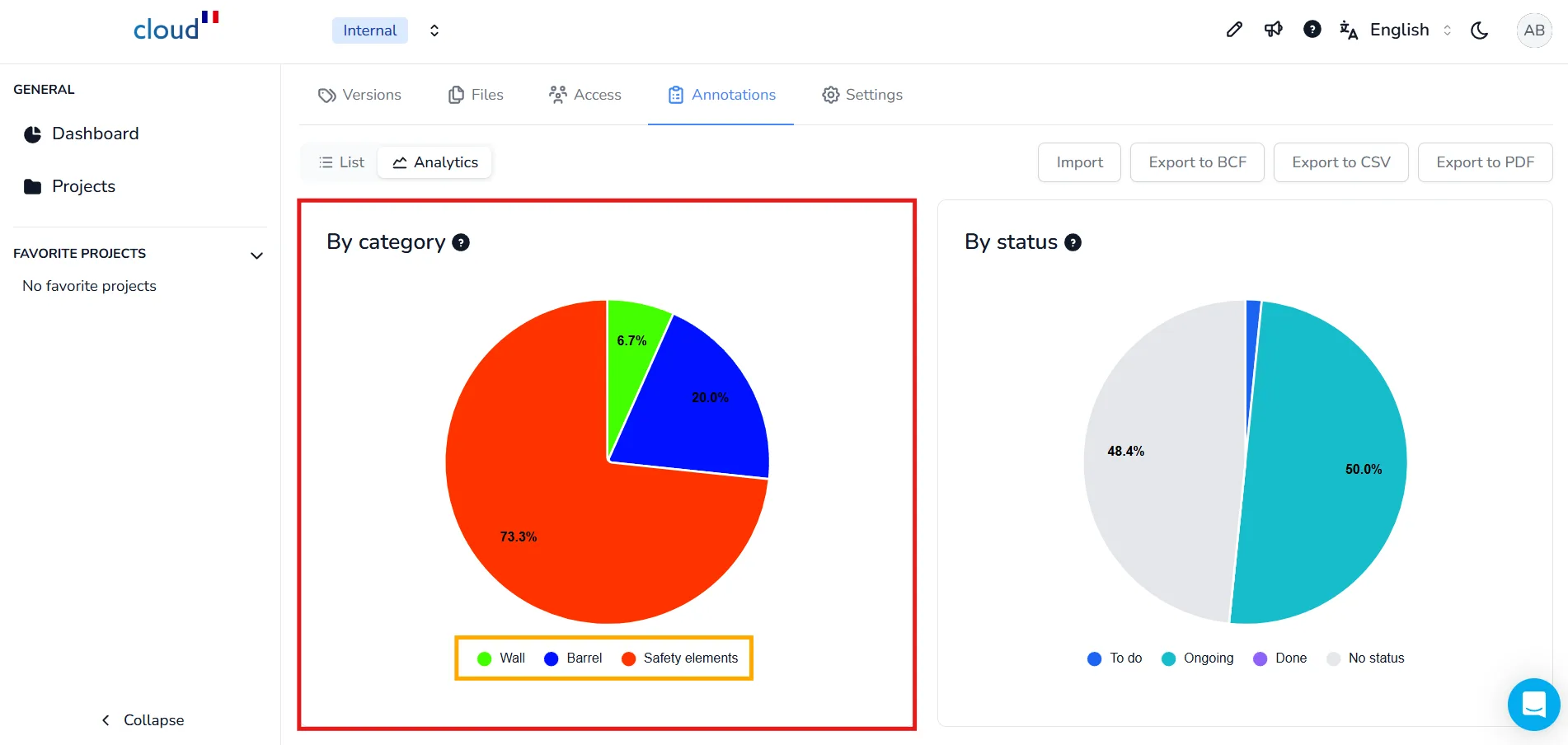
Category Graph
On the left side of the Analytics page, you will find the category graph, a pie chart that shows the distribution of annotation categories in your project.
This chart allows you to quickly identify which category is the most common, which can be useful when:
-
Working with custom categories based on your internal workflow
-
Comparing the balance between issues, equipment, or progress elements
For example: Safety elements represent more than 73.3% of all annotations the remaining annotations are divided between Barrel and Wall
You can hover your mouse over each colored section to:
-
Display the exact number of annotations it represents
-
Highlight that portion for easier visual tracking
To learn how to create your own categories, visit the Custom Category article
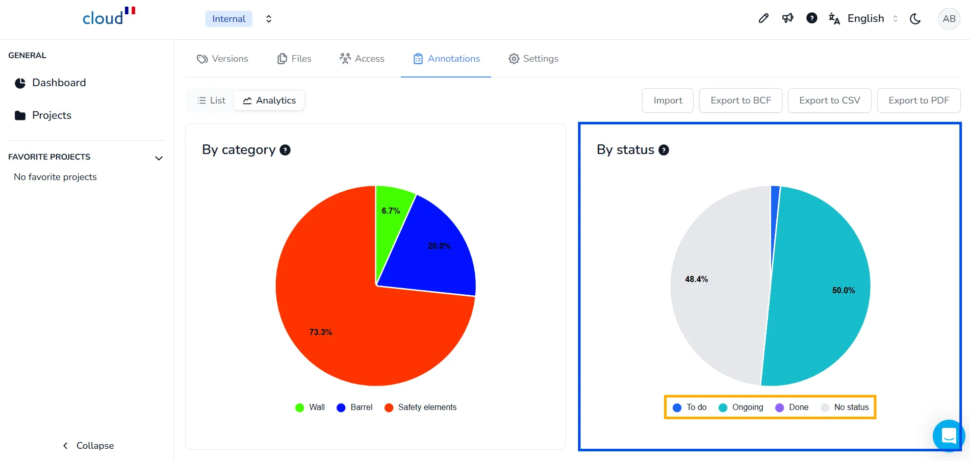
Status Graph
On the right side of the Analytics page, you will find the status graph, which summarizes the progress state of all annotations At a glance, this chart helps you understand how tasks are distributed between different statuses:
-
To do
-
Ongoing
-
Done
-
No status
This is a quick way to identify if most of the project’s actions are pending, in progress, or completed.
All these graphs, charts and tables can be exported via the PDF export, for more information on that follow the dedicated article.
If you have any problem or difficulties, please do not hesitate to contact the platform's team.